Creating a Chart
Creating a chart is actually quite easy. With the following steps you'll be able to easily use Charts in your Excellentable.
Step 1
Log into your Confluence account that has the Excellentable application enabled.
Step 2
Open, or create, an Excellentable.
Step 3
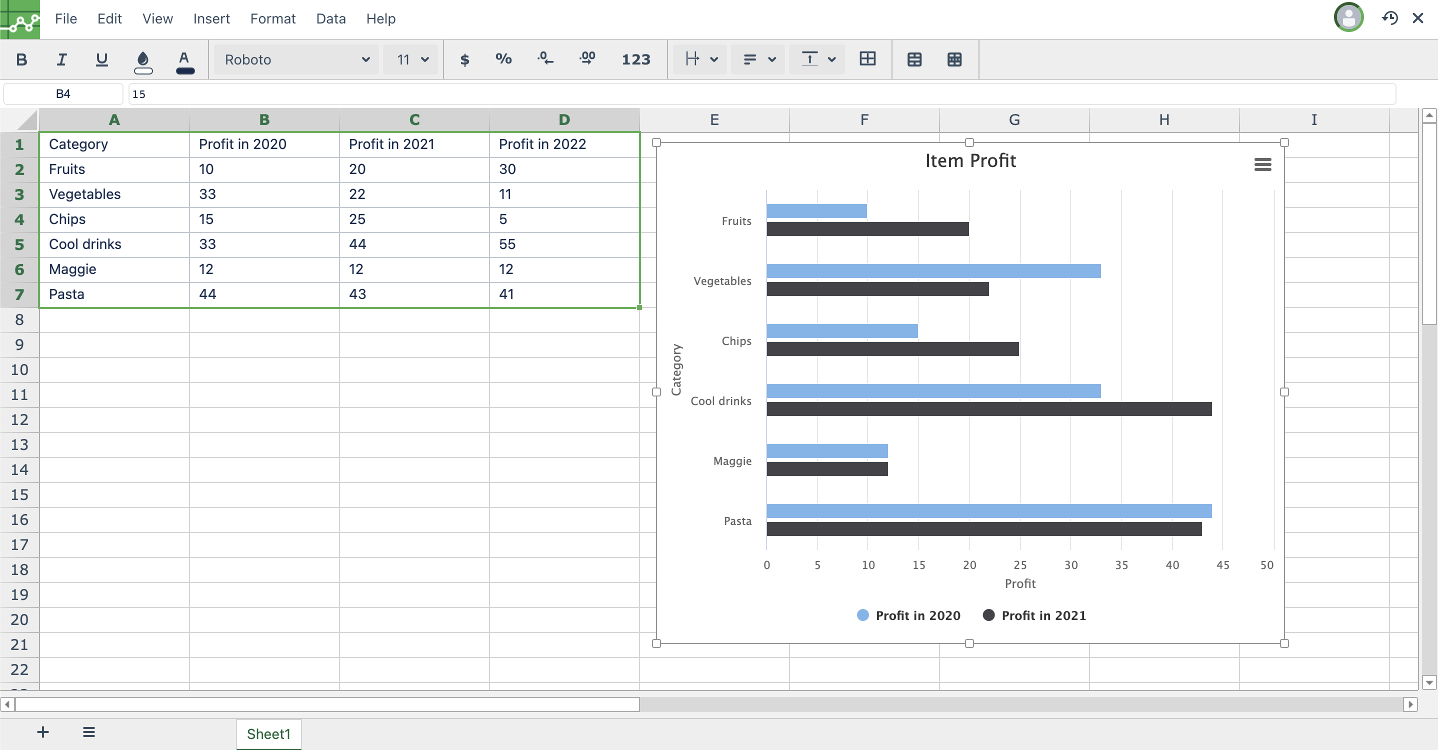
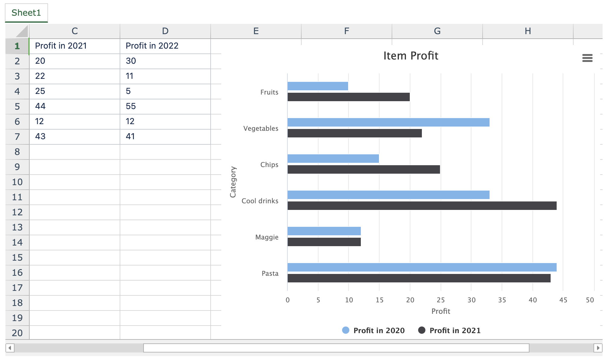
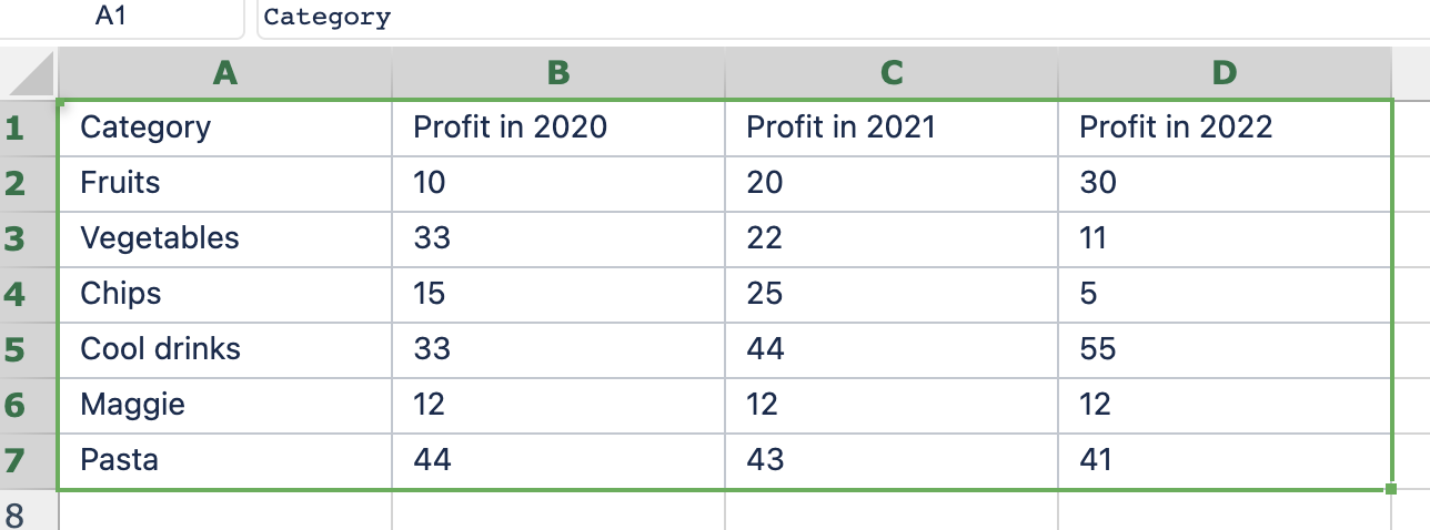
Select the data you wish to turn into a chart.
Step 4
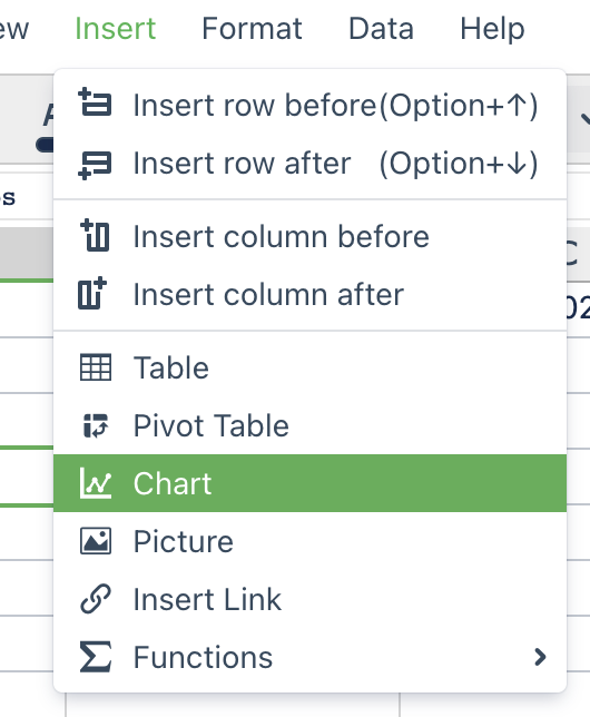
Open the "Insert" menu and select "Chart" from the options
Step 5
You will now be brought to the Chart creation view.
Step 6
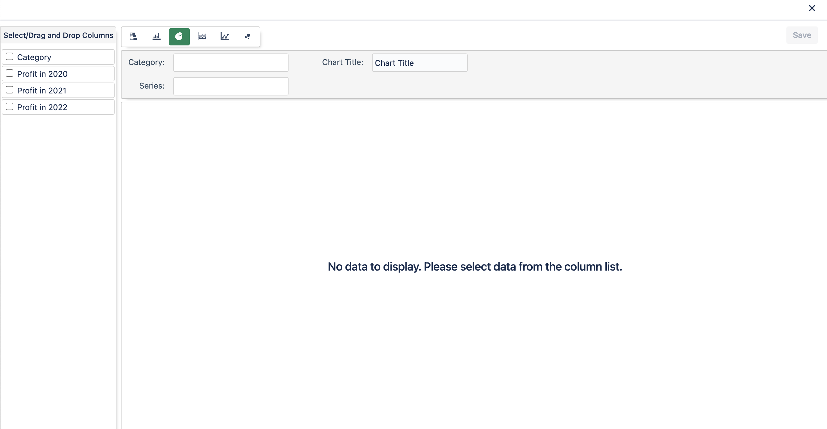
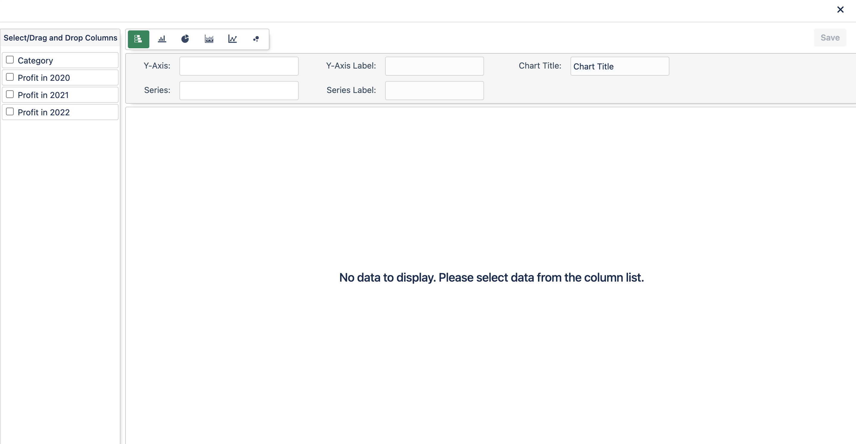
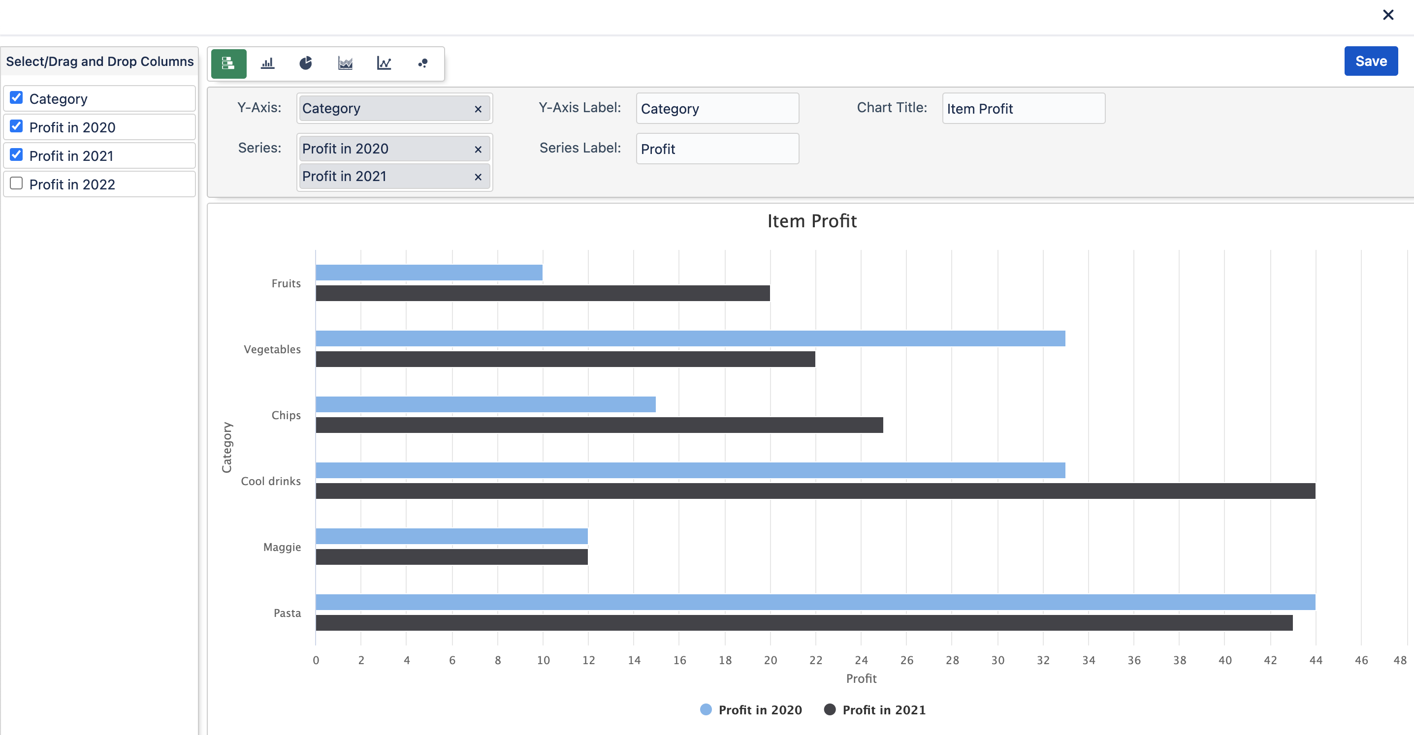
Select which chart type you wish to use. Chart options are Bar, Column, Pie, Area, Line, and Scatter charts.
(Note: Depending on the Chart selected, the required data will be different
Bar, Column, Area, Line, and Scatter Chart View
Pie Chart View
Step 7
Either drag and drop or click the check mark next to the column options into the "Y-Axis" and "Series" fields (for Bar, Column, Area, Line, and Scatter Charts), or "Category" and "Series" fields (for Pie Charts). You can also add your own text to the "Y-Axis Label," "Series Label," or "Chart Title" if you so desire to label those areas. Leaving them blank is an option as well.
Step 8
Click Save at the top right of the chart view to save your chart.
Step 9
The Chart is now on your Excellentable. Now just save the Excellentable and the chart will be available to view on the Confluence page.