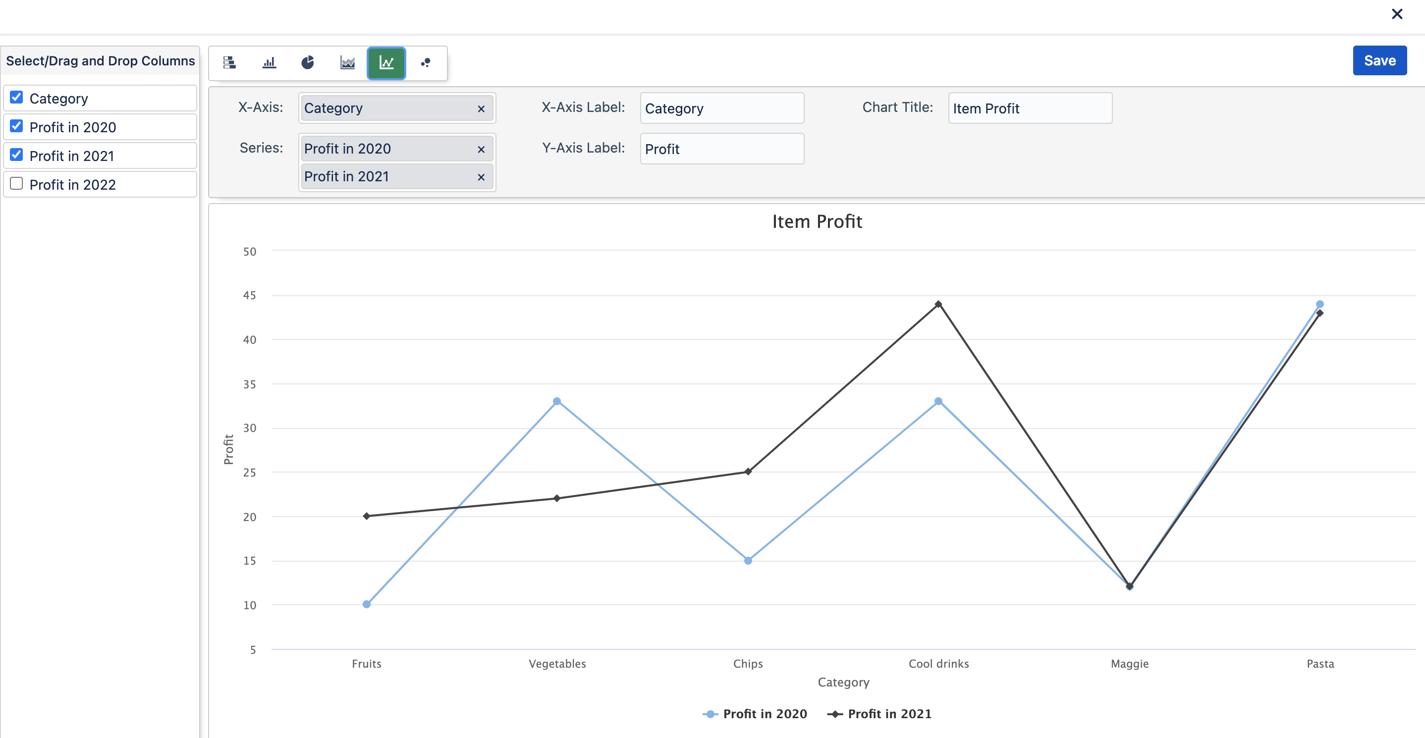
Line Chart
What is a Line Chart?
In a line chart, category data is distributed evenly along the horizontal axis, and all value data is distributed evenly along the vertical axis. Line charts can show continuous data over time on an evenly scaled axis, so they're ideal for showing trends in data at equal intervals, like months, quarters, or fiscal years.
What type of chart is best used with a Line Chart?
Data that's arranged in columns or rows on a worksheet can be plotted in a line chart.
Example