Scatter Chart
What is a Scatter Chart?
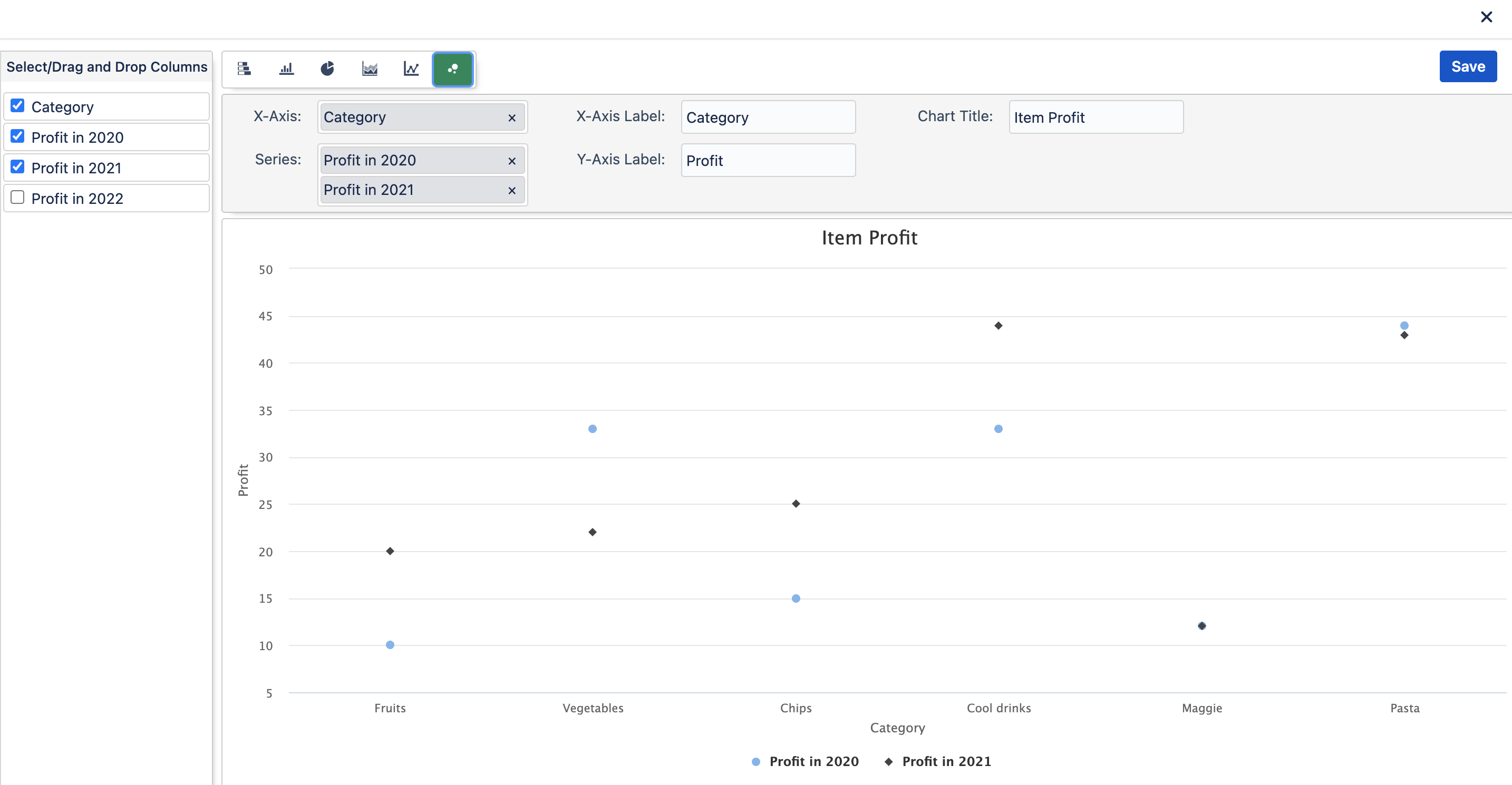
Data that's arranged in columns and rows on a worksheet can be plotted in an xy (scatter) chart. Place the x values in one row or column, and then enter the corresponding y values in the adjacent rows or columns.
A scatter chart has two value axes: a horizontal (x) and a vertical (y) value axis. It combines x and y values into single data points and shows them in irregular intervals, or clusters. Scatter charts are typically used for showing and comparing numeric values, like scientific, statistical, and engineering data.
What type of data is best used with a Scatter Chart?
Data that's arranged in columns and rows on a worksheet can be plotted in an xy (scatter) chart
Example